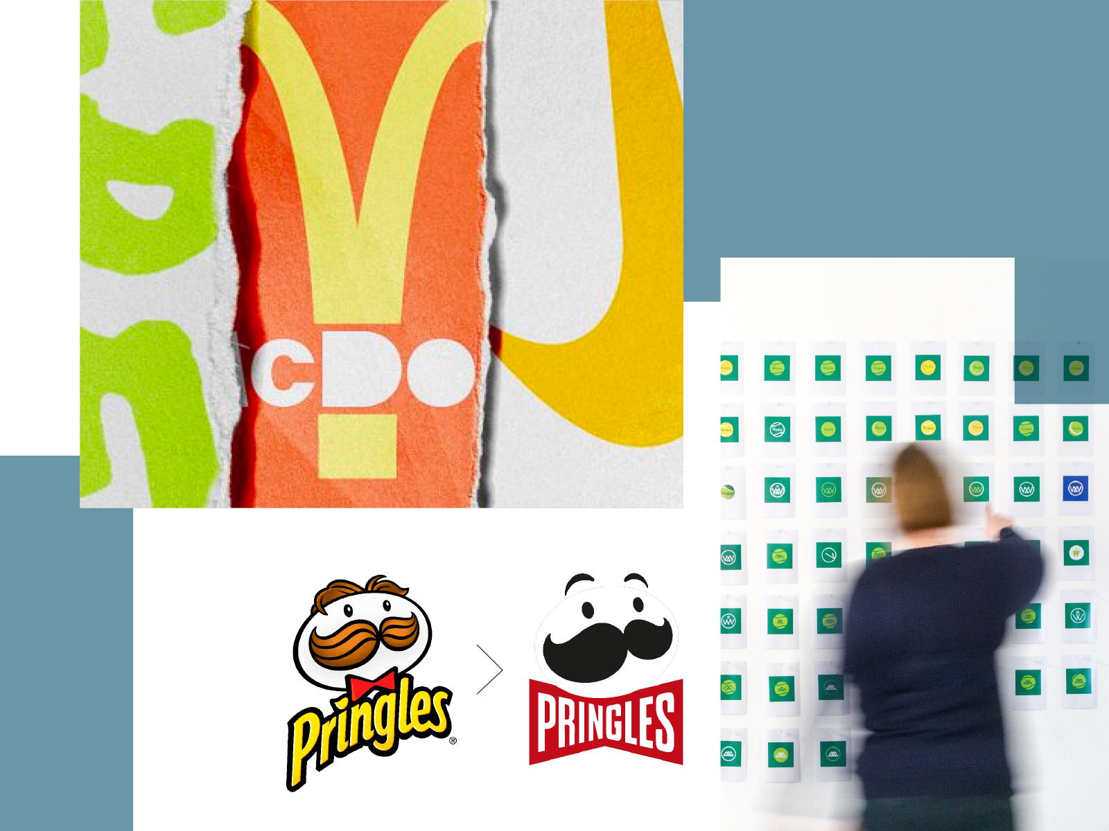
There is a very strong reason to want to debrand—or to simplify; to reduce all distractions around the visual identity of a brand and all its marketing materials, such as the website and packaging.
In the past, there was a very real sense that identities had to be incredibly clever and complex, with the use of drop shadows, blurs, vignettes, and small details in their design. This became even more the case when we all became addicted to our smartphones. You undoubtedly remember the ‘busy’ logos, where designers adapted their skills by developing over-the-top iconography and brand identities. But the fact is that times have changed, and it is reflected throughout the design world—from retail chains to fashion labels and from tech companies to digital service providers—simplicity always wins.
However, we should not just start simplifying without consideration. Let’s first ask whether digitalization takes away the uniqueness of an individual brand. Most websites, for example, are designed with cookies in mind, so they are ‘Google-friendly’. But that doesn’t mean your identity should be simple, or worse, generic.
All designers and brand custodians should be encouraged to carefully consider what makes a brand and its identity unique, and then apply these valuable insights to every new or refreshed design.
The simplification of fonts—a sleek, easy-to-read sans-serif text, for example.
There is also currently a resurgence in the use of symbols. This is due to the fact that many things are happening on small screens in today’s world, rather than on a large desktop monitor. A symbol must work on a mobile device and on small smartwatch screens. Many brands are associated with an app and a symbol is not only easier to read than a word, but also fits into a square—as an ‘app icon’.
The simplification of fonts—a sleek, easy-to-read sans-serif text, for example—is also somewhat due to the icons of the apps we use. Naturally, it makes sense not to waste time and resources developing unique fonts when a customer only sees a symbol on their phone. The rise of emoticon language, used as shorthand instead of cumbersome typing, has also had an impact: why use words when a simple graphic icon can do the same job faster?
The obvious examples, usually found in every brief for a new identity, are Nike and Apple. Much was done to arrive at the Nike logo, developed in 1973 by Carolyn Davidson (long before ‘just do it’ was created as a slogan).
The challenge to anyone is to present that identity to a client, because actually, it’s just a ‘simple’ swoosh, right? Today we would be thrown out of the room because we weren’t trying hard enough. And yet, Nike often opts to use only the swoosh in much of its communication, rarely using their name.
The Apple logo is another amazingly good piece of design by Rob Janoff in 1977. It’s ‘just’ an apple with a bite (or byte for the nerds)—it’s not particularly clever—but it’s good. The reason for the bite? So that it doesn’t look like a cherry tomato! It’s clear today that the designers and clients of the time were brave enough to embrace ‘easy’ design. They were years ahead in understanding the power of simplicity. Of course, both brands have also spent many billions of dollars on marketing and branding their logo on all their products, making it recognizable today. But still. Good to remember and embrace: if you don’t have billions to spend, don’t expect the same brand recognition as Nike or Apple, but be as brave as Phil Knight, Bill Bowerman, Steve Jobs, and Steve Wozniak.

Finally, we must be very careful that brands do not start to look alike. Preserve the brand’s personality, make it recognizable, and you have an identity that looks fresh, memorable, and, more importantly, future-proof.